Monday, November 26, 2007

David Mazzuchelli Analysis Questions


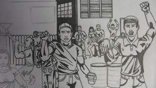
Here on the right is a classic example of a Mazuchelli piece. More than 50% of this drawing is black space, but it adds to the piece. There are not alot of descriptive lines in this piece, just the bare minimum required to convey an image. There is a good balance between the left and right side of the drawing. Batman's cape makes him look more imposing because of the way it is shaped. It is shaped so that all the black space above him seems to be part of his figure. This drawing is very high contrast. There are only about 4 values in this piece, black, white and two shades of gray but that is all that is necessary. I think that the artist intended for this drawing to be very disorienting and very dark and it completely works. I would say that this drawing is done in contour line, there is some descriptive line used in the figure on the right's jacket but those lines are more of blocks of black than lines. I got this image off Wikipedia but it was featured in the "Comics on the Verge" exhibit in 2004. This is the cover of Batman #407.

David Mazzuchelli


Dave Mazzuchelli was born in 1960 and he is a famous comic book artist whose best work came in the early 1990s. He worked on many critically acclaimed story arcs for Marvel comics and for DC comics such as Batman: Year One and Daredevil: Born Again. Both of Mazzuchelli's most famous works were written by the famous comic book writer Frank Miller. I like Mazzuchelli's unique visual style. Many comic book artists are very detail oriented and obsessed with the small details in their compositions. Mazzuchelli is very bold and abstract, his work is very simplistic but it conveys a powerful message of contrast and boldness. His heroes and villians are very dynamic and bold. On the right is a very famous drawing of Batman that he drew, instead of focusing on Batman's muscular structure he focuses instead on Batman's cape and all the folds. An exhibit featuring David Mazzuchelli was called "Comics on the Verge" and it was at the Decker Gallery at the Maryland Institute College of Art in Baltimore. The exhibit ran from January to March 2004. In recent years Mazzuchelli no longer illustrates regularly for the major comic book companies. His heyday was in the early ninties. He is not the most famous comic book artist, he is no Jack Kirby or Steve Ditko, but nonetheless is he influential for the way he draws comic books. Few artists utilize his style, many use the style of Jim Lee as theri inspiration but I prefer the styles of Mazzuchelli.

Thursday, November 1, 2007

12 Adjectives

1. Dynamic
2. Powerful
3. Contrasting Values
4. Black and White
5. Importance
6. Color
7. Epic
8. Comic Book
9. Idealized
10. Perfected
11. Proportions
12. Anatomy

100 Words

Bright. Bold. Defined. Dark. Contrast.
Comic. Epic. Dynamic. Bright. Pencil.
Black. White. Gray. Red. Charcoal.
Power. Strength. Idealized. Perfect. Good.
Animated. Cartoon. Poster. Graphic. Design.
Letters. Font. Pictures. Words. Story.
Rendered. Detailed. Intricate. Complex. Webwork.
Futuristic. Fantasy. Science. Technology. Weaponry.
Soldiers. Aliens. Pirates. Bikinis. Superheroes.
Gore. Violence. Bullets. Blood. Boobs.
Hair. Legs. Arms. Chests. Faces.
Anatomy. Proportion. Muscle. Punching. Shooting.
Cityscapes. Perspective. Rooftops. Heights. Vertigo.
Lights. Cars. Planes. Helicopters. Explosions.
Space. Planets. Worlds. Skies. Peace.
Women. Girls. Skirts. Tank Tops. Underwear.
Destruction. Fire. Missiles. Tanks. Lips.
Cigarettes. Tattoos. Uniforms. Swords. Armor.
Fighting. Killing. Demons. Monsters. Mutants.
Animals. Landscapes. Objects in space. Motion. Ink.